CMIP6 model topics
Overview
Teaching: 0 min
Exercises: 0 minQuestions
SSW…
QBO…
BDC…
ENSO…
NAO…
Monsoon circulation
Objectives
Analyze CMIP6 data
Interpret CMIP6 data
Prepare graphs using python
Post processing and visualization
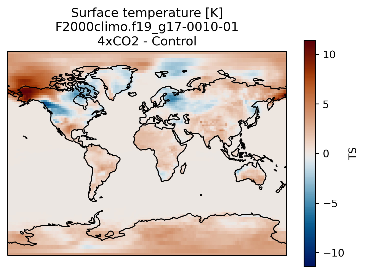
You can always compare the results of your experiments to the control run, at any time (i.e., this applies for both the short and long runs).
An easy way to do this is to calculate the difference between for example the surface temperature field issued from the control run and that from your new experiment.
Visualization with xarray
On jupyterhub:Start a new pangeo notebook on your JupyterHub (in this example we assume we have the first month of data from the 4xCO2 experiment).
import os
import xarray as xr
import cartopy.crs as ccrs
import matplotlib.pyplot as plt
%matplotlib inline

experiment = 'F2000climo.f19_g17'
month = '0010-01'
username = # your username on NIRD here

path = 'shared-ns1000k/GEO4962/outputs/runs/F2000climo.f19_g17.control/atm/hist/'
filename = path + 'F2000climo.f19_g17.control.cam.h0.' + month + '.nc'
dsc = xr.open_dataset(filename, decode_cf=False)
TSc = dsc['TS'][0] # the [0] is necessary because the two datasets have different time indices

path = 'shared-ns1000k/GEO4962/outputs/' + username + '/archive/F2000climo.f19_g17.CO2/atm/hist/'
filename = path + 'F2000climo.f19_g17.CO2.cam.h0.' + month + '.nc'
dsco2 = xr.open_dataset(filename, decode_cf=False)
TSco2 = dsco2['TS'][0]

diff = TSco2 - TSc

fig = plt.figure()
ax = plt.axes(projection=ccrs.Miller())

diff.plot(ax=ax,
           transform=ccrs.PlateCarree(),
           cmap=load_cmap('vik')
           )

ax.coastlines()
plt.title('Surface temperature [K]\n' + experiment + '-' + month + '\n4xCO2 - Control')
Making bespoke graphs with python
Let’s make a basic contour plot with python.
On jupyterLab:Now we can make a contour plot with a single command.
On jupyter:TSco2.plot.contourf()
to obtain this:
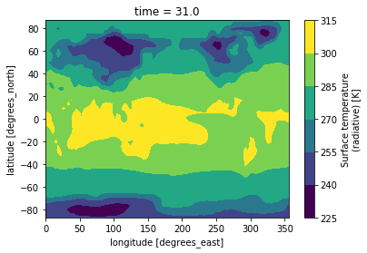
This figure is not very useful: we do not know which projection was used, there is no coastline, we would rather have a proper title, etc.
To do that we need to add a bit more information.
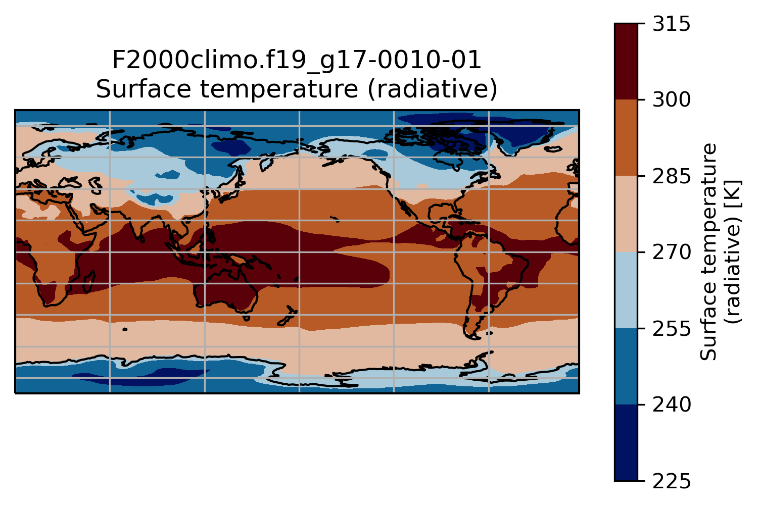
On jupyter:import matplotlib.pyplot as plt
import cartopy.crs as ccrs
ax = plt.axes(projection=ccrs.PlateCarree(central_longitude=180))
TSco2.plot.contourf(ax=ax,
transform=ccrs.PlateCarree())
ax.set_title(experiment + '-' + month + '\n' + TSco2.long_name)
ax.coastlines()
ax.gridlines()
This is a slightly better plot …
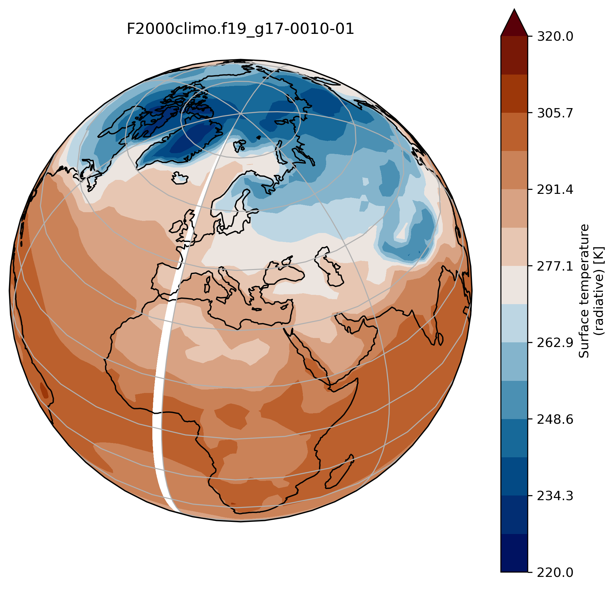
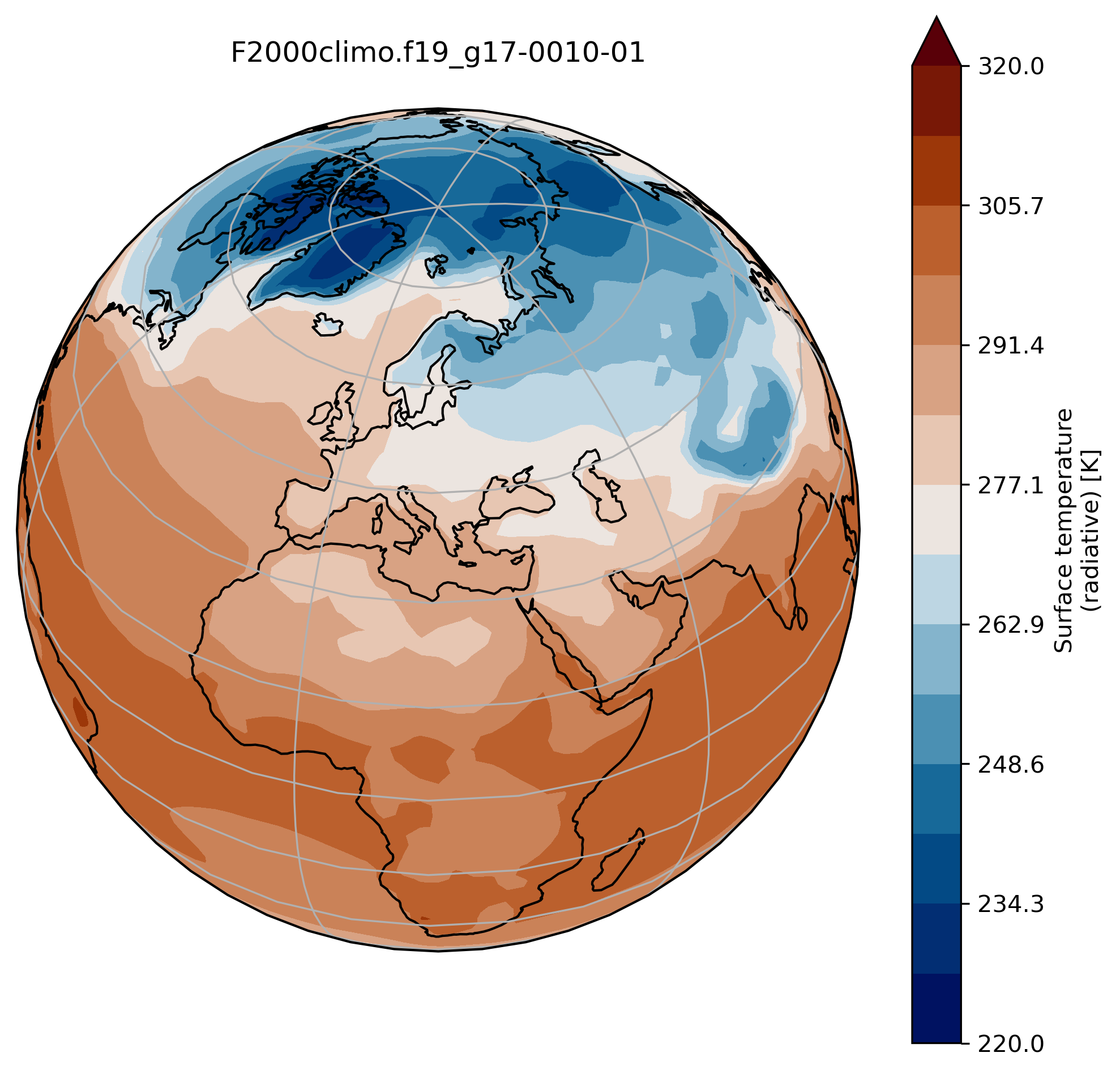
Change the default projection
It is very often convenient to visualize using a different projection than the original data:
On jupyter:TSmin = 220
TSmax = 320
fig = plt.figure(figsize=[8, 8])
ax = fig.add_subplot(1, 1, 1,
projection=ccrs.Orthographic(central_longitude=20, central_latitude=40))
TSco2.plot.contourf(ax=ax,
transform=ccrs.PlateCarree(),
extend='max',
cmap=load_cmap('vik'),
levels=15,
vmin=TSmin, vmax = TSmax)
ax.set_title(experiment + '-' + month + '\n')
ax.coastlines()
ax.gridlines()
wrap around longitudes
On jupyter:# what is longitude min and max? print(TSco2.lon.min(), TSco2.lon.max())To fill the gap, we can wrap around longitudes i.e. add a new longitude band at 360. equals to 0.
from cartopy.util import add_cyclic_point

TSmin = 220
TSmax = 320

# max longitude is 357.5 so we add another longitude 360. (= 0.)
TS_cyclic_co2, lon_cyclic = add_cyclic_point(TSco2.values, coord=TSco2.lon)
# Create a new xarray with the new arrays
TSco2_cy = xr.DataArray(TS_cyclic_co2, coords={'lat':TSco2.lat, 'lon':lon_cyclic}, dims=('lat','lon'),
                       attrs = TSco2.attrs )

fig = plt.figure(figsize=[8, 8])
ax = fig.add_subplot(1, 1, 1,
                     projection=ccrs.Orthographic(central_longitude=20, central_latitude=40))

TSco2_cy.plot.contourf(ax=ax,
                      transform=ccrs.PlateCarree(),
                      extend='max',
                      cmap=load_cmap('vik'),
                      levels=15,
                      vmin=TSmin, vmax = TSmax)

ax.set_title(experiment + '-' + month + '\n')
ax.coastlines()
ax.gridlines()
You can now use the command savefig to save the current figure into a file.
On jupyter:fig.savefig(experiment + '-' + month + '.png')
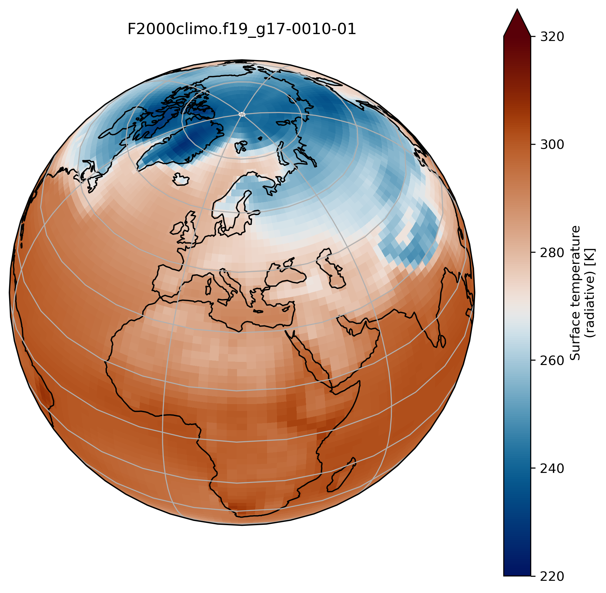
contourf versus pcolormesh
So far, we used contourf to visualize our data but we can also use pcolormesh.
Change contourf by pcolormesh
Change contourf by pcolormesh in the previous plot.
What do you observe?
Solution
import os
import xarray as xr
import numpy as np
import cartopy.crs as ccrs
from cartopy.util import add_cyclic_point
import matplotlib.pyplot as plt

%matplotlib inline


experiment = 'F2000climo.f19_g17'
month = '0010-01'
username = 'herfugl' # you NIRD username here

path = 'shared-ns1000k/GEO4962/outputs/' + username + '/archive/F2000climo.f19_g17.CO2/atm/hist/'
filename = path + 'F2000climo.f19_g17.CO2.cam.h0.' + month + '.nc'

dsco2 = xr.open_dataset(filename, decode_cf=False)
TSco2 = dsco2['TS'][0]

TSmin = 220
TSmax = 320

# max longitude is 356.25 so we add another longitude 360. (= 0.)
TS_cyclic_co2, lon_cyclic = add_cyclic_point(TSco2.values, coord=TSco2.lon)
# Create a new xarray with the new arrays
TSco2_cy = xr.DataArray(TS_cyclic_co2, coords={'lat':TSco2.lat, 'lon':lon_cyclic}, dims=('lat','lon'),
                       attrs = TSco2.attrs )

fig = plt.figure(figsize=[8, 8])
ax = fig.add_subplot(1, 1, 1,
                     projection=ccrs.Orthographic(central_longitude=20, central_latitude=40))

TSco2_cy.plot.pcolormesh(ax=ax,
                      transform=ccrs.PlateCarree(),
                      extend='max',
                      cmap=load_cmap('vik'),
                      vmin=TSmin, vmax = TSmax)

ax.set_title(experiment + '-' + month + '\n')
ax.coastlines()
ax.gridlines()
Create multiple plots in the same figure
See here.
On jupyter:import os
import xarray as xr
import numpy as np
import cartopy.crs as ccrs
from cartopy.util import add_cyclic_point
import matplotlib.pyplot as plt
%matplotlib inline
experiment = 'F2000climo.f19_g17'
username = # your NIRD username here
path = 'shared-ns1000k/GEO4962/outputs/' + username + '/archive/F2000climo.f19_g17.CO2/atm/hist/'
fig = plt.figure(figsize=[20, 8])
TSmin = 220
TSmax = 320
for month in range(1,4):
filename = path + 'F2000climo.f19_g17.CO2.cam.h0.0010-0' + str(month) + '.nc'
dset = xr.open_dataset(filename, decode_cf=False)
TSco2 = dset['TS'][0]
lat = dset['lat']
lon = dset['lon']
dset.close()
TS_cyclic_si, lon_cyclic = add_cyclic_point(TSco2.values, coord=TSco2.lon)
TSco2_cy = xr.DataArray(TS_cyclic_si, coords={'lat':TSco2.lat, 'lon':lon_cyclic}, dims=('lat','lon'),
attrs = TSco2.attrs )
ax = fig.add_subplot(1, 3, month, projection=ccrs.Mollweide()) # specify (nrows, ncols, axnum)
cs = TSco2_cy.plot.contourf(ax=ax,
transform=ccrs.PlateCarree(),
extend='max',
cmap=load_cmap('vik'),
vmin=TSmin, vmax = TSmax,
levels=15,
add_colorbar=False)
ax.set_title( 'month ' + str(month) + '\n')
ax.coastlines()
ax.gridlines()
fig.suptitle(experiment + '-0010'+'\n' + TSco2.long_name, fontsize=24)
# adjust subplots so we keep a bit of space on the right for the colorbar
fig.subplots_adjust(right=0.8)
# Specify where to place the colorbar
cbar_ax = fig.add_axes([0.12, 0.28, 0.72, 0.03])
# Add a unique colorbar to the figure
fig.colorbar(cs, cax=cbar_ax, label=TSco2.units,
orientation='horizontal')
Key Points
Analyze CMIP6 data
Interpret CMIP6 data